AMTA WEBSITE REDESIGN
RESEARCH, INFORMATION ARCHITECTURE, & UX/UI DESIGN
Reimaging a non-profit website experience via user research and UI redesign.
CLIENT:
American Music Therapy Association
MY ROLE:
UX Researcher/Designer
Project Focus & Role Impact
Team
UX Designers (3)Tools Used
Sketch, Balasmiq, InvisionWe were commissioned to redesign the website of a non-profit organization, American Music Therapy Association (AMTA). I collaborated with my team to evaluate, research, and redesign the public-facing portion of their website. Our tasks included completing a heuristic evaluation, content inventory, competitive evaluation, card sorting, site mapping, and prototyping the new website.
Timeline: 4 months
1. The Problem
The American Music Therapy Association (AMTA) is committed to the advancement of education, training, professional standards, credentials, and research in support of the music therapy profession.
Upon looking at the site, we determined that AMTA's website's user interface and information architecture could benefit from a redesign. We started with a heuristic evaluation to get an in-depth look at AMTA's site.
2. The Solution
We did user research and redesigned AMTA's information architecture and visual design.

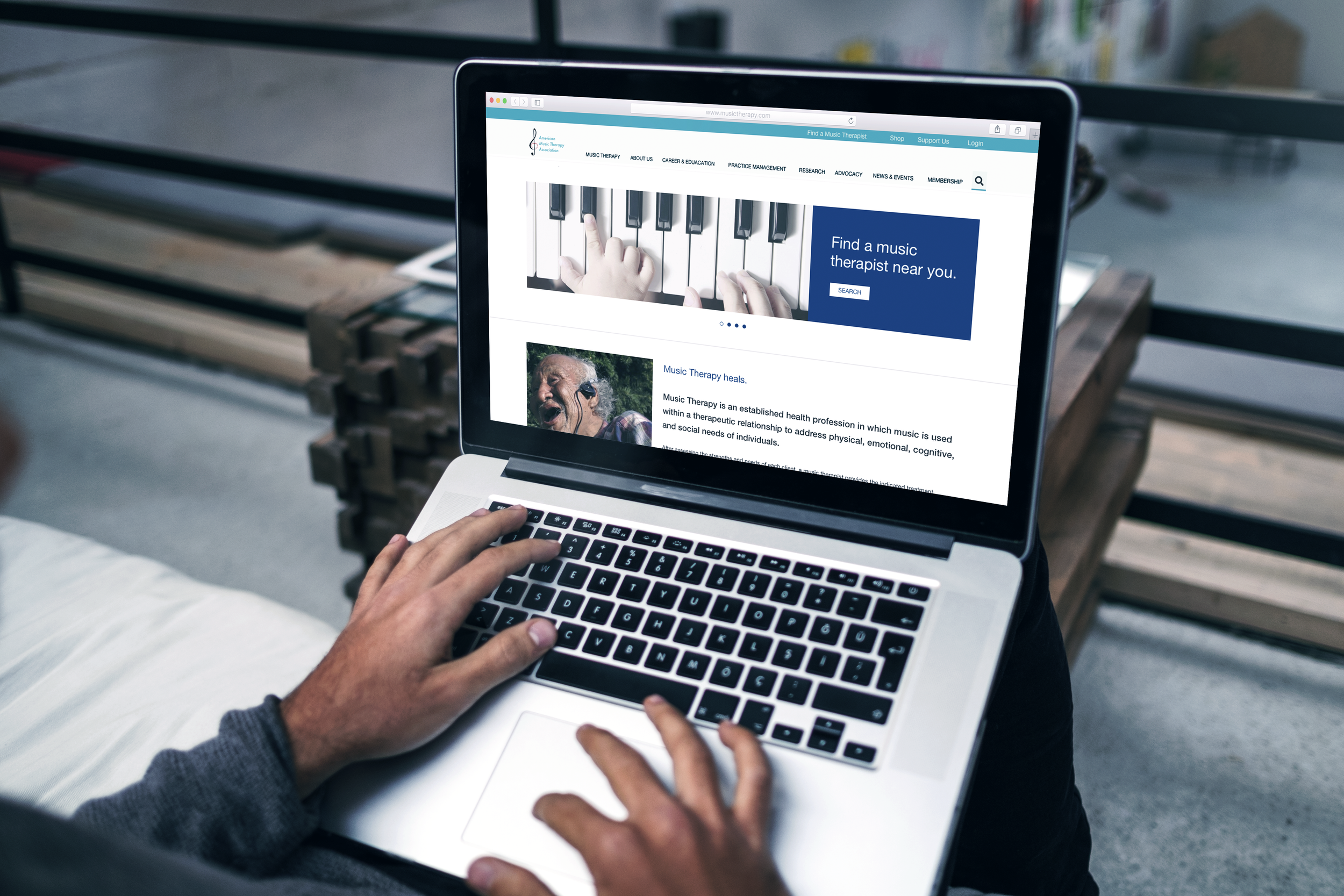
AMTA Website Demo
3. Evaluative Research
3.1 Heuristic Evaluation
Looking at the American Musical Therapy Association’s goals for their website, we were able to create AMTA’s pool of their intended audience. We identified the audience of the site as music therapists, patients and the family of current patients or potential patients, and other individuals who care about music therapy or who may want to donate to the association. We did a heuristic evaluation with these intended audiences in mind. Based on our findings, we created an initial redesign of the site.
Original AMTA website before the evaluation
Our evaluation produced 7 key observations.
We did a tentative redesign with the suggestions from the heuristic evaluation.
Observation 1
Analysis:
Global navigation, and not organized by task or user group
Suggested Revision:
Modify as local navigation to homepage
Order buttons by task and classify user group by color
Observation 2
Analysis:
Low accessibility because there are too many quicklinks
Suggested Revision:
Decrease the number of items
Organize by user need
Observation 3
Analysis:
Separated from the donation task button, but has the same function
Suggested Revision:
Combine this section with the donation task button
Observation 4
Analysis:
Lack of clarity concerning which credit goes to which picture
Suggested Revision:
Discard this section and place credits under each photo as a caption
Observation 5
Analysis:
Two global navigations on pages: top global navigation and bottom navigation
The search bar takes up too much space
Suggested Revision:
Merge the two navigation bars
Simplify to two rows: member login and general navigation bar
Observation 6
Analysis:
The primary audience are music therapists, so the information provided in the carousel is not very helpful
Can be repurposed
Suggested Revision:
Use the carousel to show news, and merge it with the Latest News section
Observation 7
Analysis:
There is no separation between different the articles
Each article takes up lots of space and can potentially overwhelm the reader
Suggested Revision:
Provide clear division between each article
Shorten the length of each article by only showing the highlights
Initial website redesign with revisions
3.2 Content Inventory
Based on the evaluation, the AMTA site offers a lot of information, but it could be better organized.
The content hierarchy of the site is three levels. The first level is the menu level (e.g. Home, Contact, and News). The rest of the levels are sub-content of the first level. Here, we found that within most of the first level pages are the links to their low-level pages, so the pages are redundant. Also, we found that there are many duplicate pages. Some pages require an AMTA member login, so we couldn’t get any information from those pages. The website page format consists of either .html or .pdf. For users, especially those who visit the website via mobile devices, these inconsistent formats are difficult to navigate.
A portion of our content inventory.
3.3 Peer Analysis (Competitive Evaluation)
We did a peer analysis to compare the AMTA website with other sites to know what features are necessary to keep, add, or delete. We selected our therapy non-profit peers. Our focus was to organize the content of the AMTA website, so we prioritized looking at the information architecture.
Peer analysis
To sum it up:
AMTA scored high in ambiguous organization because a lot of the IA involved organizing by task.
AMTA can improve the simplicity of language and consistency of terms on their site by changing the wording of their labels.
AMTA performs the worst visually among all websites. The site is not responsive, the homepage is wordy, and the site color consistency is low.
4. Ideation
4.1 Personas
Because we could not connect with any music therapists and organizations due to limited time and resources, we did not interview any music therapists for the personas.
We searched and read existing interviews of music therapists, gathered information from these interviews, and categorized them. We created two personas based on our research.
Crystal represents music therapists who are middle-aged and are established in the field.
Elizabeth represents new therapists who want to get into the music therapy field.
4.2 Card Sorting
To initiate the reorganization of AMTA, we conducted a card sorting analysis. To conduct the card sorting efficiently, we used online card sorting tool built by Optimal Workshop.
Before the cardsort: 27 categories
After the cardsort: 13 categories
We started with 27 categories. There were 13 participants in the card sorting test. After the card sorting, we listed all the existing categories and their child pages and decreased the number of the categories from 27 to 13. We split the final 13 categories into three parts: main navigation, top navigation, and footer.
5. Design
5.1 Low-Fidelity Mockup
After card sorting, we examined and reorganized the whole website. We assigned each page to its new category. This is the homepage of our low fidelity mockup.
Low-fi mockup homepage
5.2 Usability Testing
We recruited 5 users for usability test. According to the instructions from the Nielsen Norman Group, we created a list of three user scenarios. In order to meet the needs of the website, the users assumed the role of music therapists, patients and family, and other individuals.
During the test, some of the users wondered whether or not they needed to login to the system to complete different tasks. Some also related the word "Support" to "Tech Support" and not "Donate" as we intended.
Initial ATMA site modification
New modification after usability testing
5.3 High-Fidelity Mockup
After recreating the new sitemap, we designed our high-fidelity prototype.

Learning Points
I learned he whole user experience research process for redesigning a website.
It's difficult to use Sketch in group work because it doesn’t support online co-working, so it was hard to keep our pages consistent as we redesigned.
A competitive analysis is extremely helpful in seeing whether or not a product meets industry standards. In the end, we found that we had to add these standards to our redesign.
Moving Forward
We want to create and design for a persona for individuals who are not therapists. This persona:
may use the website with the role of a patient
may want to education themselves about music therapy