LONGHORN MOBILE MARKET
UX RESEARCH, SERVICE DESIGN, & UX DESIGN
Creating a safe peer-to-peer market experience for UT students.
CONCEPT:
P2P Market
MY ROLE:
UX Designer & Researcher
Project Focus & Role Impact
Team
Experience Designers (3)Tools Used
Sketch, InVision, Google WorkspaceLonghorn Mobile Market is our concept design to improve the peer-to-peer buying, selling, and trading experience the University of Texas at Austin campus, as well as the greater Austin area. Collaborating with two other UX Designers, I led the storyboarding as well as the user research of this project, interviewing seven students and surveying 26 people. We designed for both the peer-to-peer interactions within the app and the transaction experiences outside the app.
Timeline: 4 months
1. The Problem
Currently, a Facebook group page called “UT buy/sell/trade” exists. University of Texas at Austin students and alumni use this page to buy, sell, trade, and give away various items such as clothing, furniture, and even cars.
However, users voiced concerns about the limitations of searching for specific items and specific sales.
2. The Solution
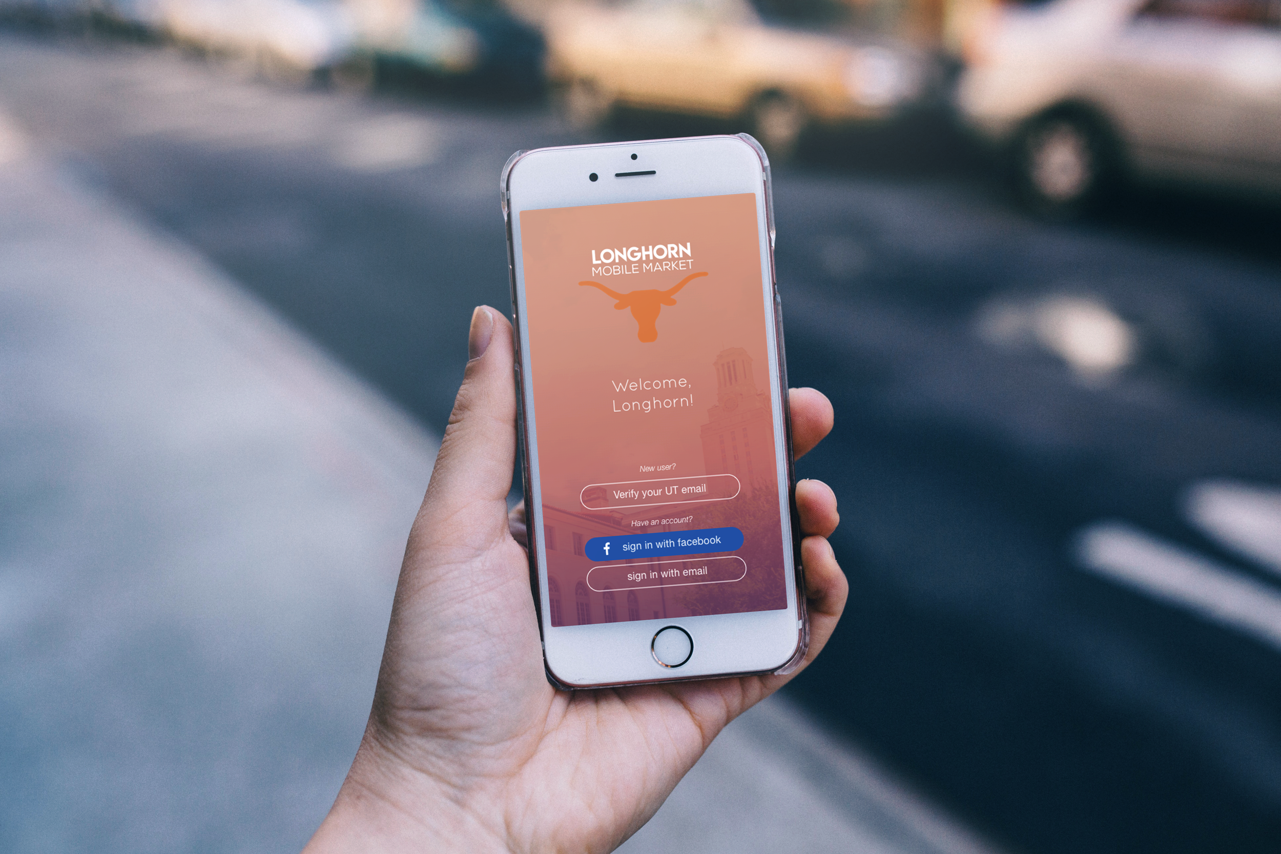
We created Longhorn Mobile Market to enhance the peer-to-peer (P2P) buying, selling, and trading experience for students at the University of Texas at Austin.

LMM App Demo
3. User Research and Interviews
3.1 Interviews and Surveys
We interviewed UT undergrad and grad students, and recent UT grads. 7 individuals were interviewed, and we surveyed 26 people, 5 of whom were not aware of the system.
Interview data
We saw some reoccurring themes and statements by the interviewees. Many of the interviewees expressed that they liked the email verification feature of the Facebook page as it ensures security. They also commented on the limitations of Facebook's search filters.
"I like that it's a safe place to sell, unlike Craigslist where you don't know who you're selling to or if they have other motives."
Interviewee 3 Quote
"The page should have separate tabs for buying, selling, and lost and found instead of having it all mixed up in one page. The search function should be more noticeable. I like the sub-categories that Craigslist has."
Interviewee 4 Quote
We determined that the predominate users use the system via:
Selling or Trading Posts, which sellers create and buyers interact with;
Buyer’s Request Posts, which buyers post to alert users who are interested in a specific item; and
Lost Posts and Found Posts, which owners and finders create.
We represented this in a usage flow model:
A photo of our sketched usage flow model
3.2 Interview Results Analysis & Workflow Activity Affinity Diagram
Some reoccurring themes that we noted as we created the WAAD included issues with post motivation, trust, page interaction, and page usability.
Constructing our Workflow Activity Affinity Diagram
4. Ideation
4.1 Feature Prioritization
The results from our research suggested that UT students would benefit from a mobile app that addresses the issue of product organization and prioritizes user security.
We decided that the main organization function would be to catalogue items by different categories in terms of item type. The app would feature a verification process that made it exclusive only to UT affiliated individuals and a meetup feature to record the intended site for their transaction.
4.2 Persona and Usage Scenarios
We started by creating a persona of a typical student that would use the page. Research showed that a typical student would be a female upperclassman that lives off-campus. Many students often look for inexpensive and expendable furniture from other students who inevitably graduate and move out of Austin.

The persona data
We determined that three usage scenarios would best demonstrate the three main actions of the app. These scenarios were: a user interested in buying, a user interested in selling, and a user finds a misplaced item.
5. Design
5.1 Interaction Design and Storyboarding
We sketched different task flows and determined the potential screens to create to follow the flow. I created a storyboard that visualized a student completing the task of posting an item on the app.
Interaction design, from the whiteboard to paper, and storyboard of a user interacting with the app
5.2 Low-Fidelity Wireframes
Sketching the wireframes allowed for a smooth transition from paper to digital.
Low-fi mockup homepage
5.3 Usability Testing
We had two phases of prototyping and testing. During the pilot testing of our initial prototype, users provided feedback to apply to our app. We used that feedback to make changes to the features.
Some issues found were confusion about the verification process, difficulty finding the meetup feature, and lack of clarity of the icons. After meeting and discussing the issues, we made revisions on the low-fis and then created the high-fidelity mockups. Invision was used for prototyping and Sketch for creating the high-fis.
5.4 High-Fidelity Wireframes
High-fidelity mockup of the email verification flow
High-fidelity mockup of the navigation level
High-fidelity mockup of the browse level
5.5 Final Prototype